Klaviyo Ascent Design System: Phone number input
A phone number input for Klaviyo's Ascent Design System. Simple on the surface. Not simple underneath.
Phone numbers aren't simple
A phone number input looks small until it has to work across countries, locales, validation states, and the rest of an app.
The component needed to give people a clear country choice, format the mask and placeholder for that country, and stay visually consistent with Klaviyo.
I spoke with stakeholders about the marketing team's earlier solutions and where they needed to go. That research made three priorities clear:
- Represent each country, with a default based on the app's locale
- Format the input mask and placeholder for the selected country
- Match the look and feel of the Klaviyo app
The goal was one component that product and marketing teams could use without solving the same problem twice.
Align the teams first
This started with a prioritized component list and Klaviyo's move into international markets. We already had a Number Input, but its variations were growing without phone number logic.
I mapped the people who needed a say: Product Design directors, Engineering Managers from the app and marketing teams, and Lead Product Designers with related experience. I interviewed them for requirements and user stories, then used Jira to keep progress visible.
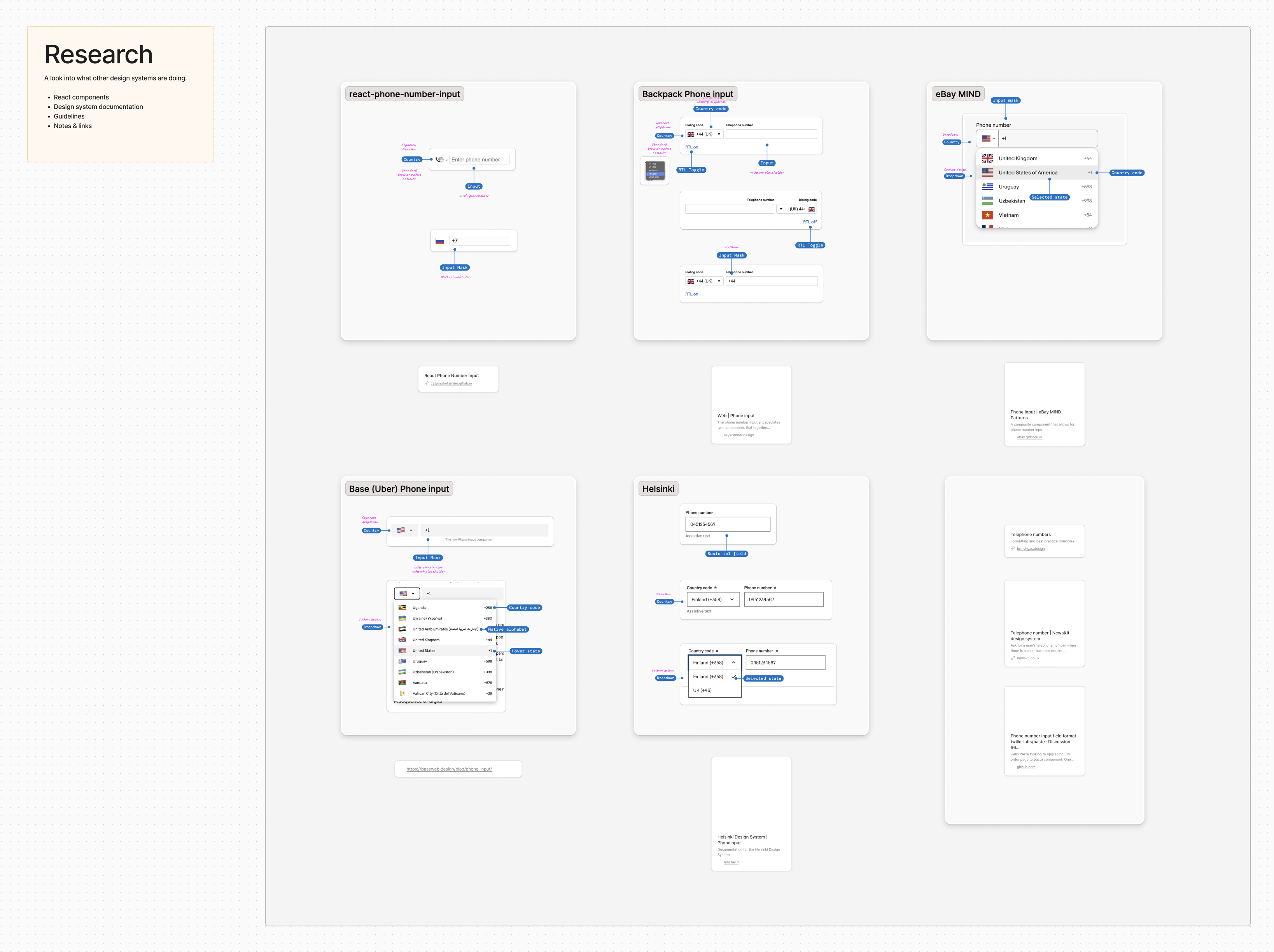
While those conversations were getting scheduled, I built a FigJam from the existing Number Input. I marked what carried over and what did not. I also looked at how other design systems and communities handled phone number inputs.
I had built the Roll by ADP phone number React input before, so the tradeoffs looked familiar. Accurate phone number formatting often requires a large dependency. Correctness has a real performance cost.
Turn requirements into rules
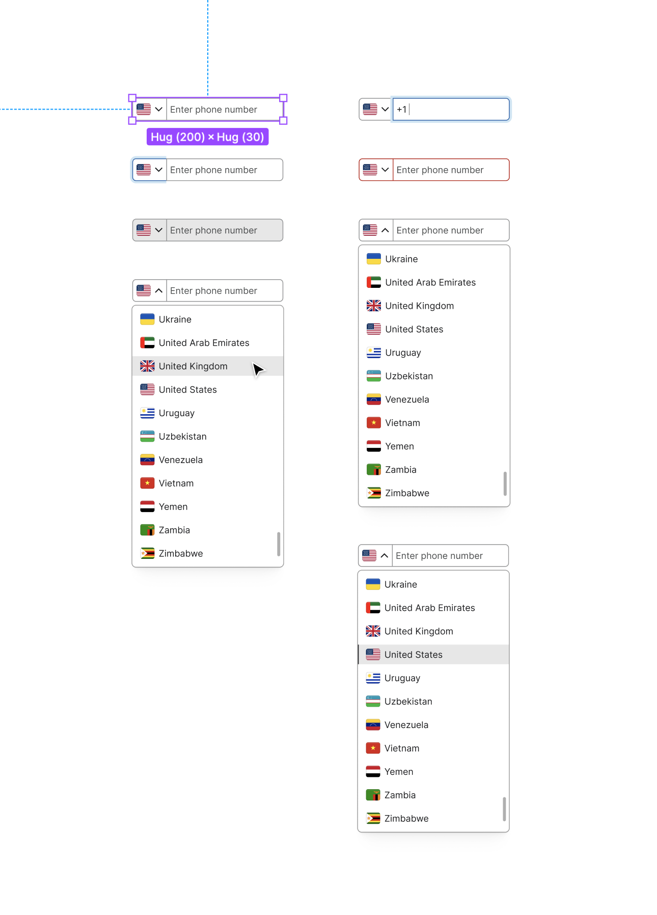
With the requirements, existing patterns, and outside research in front of me, I started sketching. The point was to make the decisions visible before locking them into Figma.
At the same time, I documented the component with the design system team's template. It covered:
- Best practices
- When to use it
- When not to use it
- Related components
- Internal components used by this component
- Rules
- Behaviors
- States: Each state the component can be in and its expected behavior
- Interactions: Mouse, keyboard, and screen reader expectations
- Content
- Content Design guidance and expectations
We reviewed the work in regular standups. I brought the decisions back to the team, then updated each stakeholder at the level they needed: bullets for a Product Owner; visuals and Figma links for designers and engineers who needed to respond.
A critique works when it stays about the decision, not the person who made it. We kept returning to the original question: does this serve the user and the business?
Make it fit the system
I start fast in Figma. Early exploration does not need every Style and Variant in place. Refinement is where the work has to fit the system.
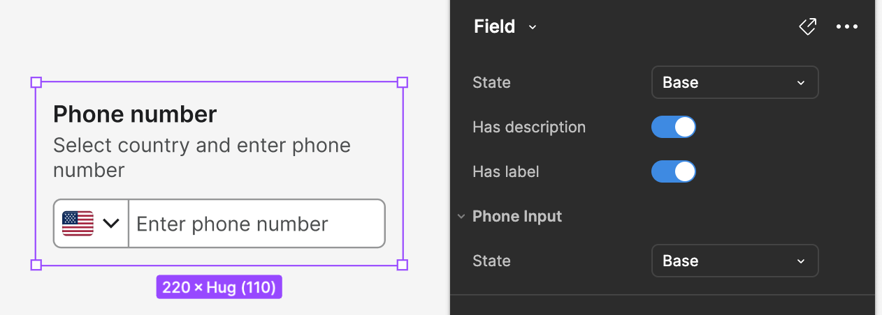
The Phone Input is a form control, like the Text Input, so I placed it in a Field to test it with other inputs, labels, descriptions, and error messages. I applied the relevant Styles and replaced parts with internal components where they already solved the problem.
The documentation then added:
- Visual examples of what to do and what not to do
- Variants: Relevant states, how they differ from the base, and the data they need
- Anatomy: Redlines and shared names for the parts that make the whole component
Finally, I cleaned up the Figma file. The components lived on the right page, with a documentation page for the relevant states and considerations.
The final handoff brought the component, its states, examples, and guidance into one place. The release process then called for a Figma library changelog update and announcements through email, Slack, direct messages, and team calls.
Build it to find the compromises
Here is the React prototype. The PhoneInput source works, with caveats. The world is imperfect. Design and development have to make tradeoffs.
Input masking is one example. The design called for the country code to stay in place. That is harder than it sounds. Another question: what should happen to a number after the CountrySelector source changes? This prototype clears the field. Is that the right experience?
Dependencies create their own tradeoffs. I used libraries for input masking, formatting, and the custom select menu instead of building them by hand. Radix, for example, adds an SVG icon when position="popper" is enabled. In this prototype, I could not remove or target that icon, so I kept Radix's native macOS menu style for the portal.
As a React prototype, it has the core pieces and keyboard access. Before production, I would test the dependency choices more deeply, compare alternatives, and study how others have handled the same problems.
Contact
Availability, partnerships, and questions.
Want to work together?
I have limited availability for consulting. Learn how I can sharpen your SaaS brand and product, or send me a note below.