Today I am going to talk about what makes a timeless logo. Let’s break down the two main types of logos. The first is a logo mark. A logo mark is a symbol that represents the brand. When used consistently, over time, it becomes recognizable and is associated with the brand. The second is a word mark also called a logo type. This is typically the company’s name or an acronym of the company’s name spelled out using a well thought out typeface and modified to fit the brand.
Depending on the client and their customers, a logo designer may decide to do one, or both of these when creating a logo. We’ll be talking about the logo marks. A timeless logo mark can be paired with a great logo type, or be on it’s own.
A logo is not communication, it’s identification. A logo makes a brand more appealing. It puts your best foot forward with regards to first impressions, can grab attention, be memorable, and separate you from the competition. A good logo feels right, like it simply fits the brand. It taps into the emotional center of what a brand represents and how it’s customers see it. The aim is to be objective and focus on functionality when creating logos.
Logos fail when they are too illustrative, too detailed, or say too much. They can also fail if they’re too generic, or confusing. Not to say there aren’t great illustrative logos. However illustrative logos tend to be too difficult to be on a pin, or smaller places like an app icon.
They can also fail when the client doesn’t understand the process and want to inject their own personal preference, or otherwise disassociate it from the brand and how it’s customers see the brand. Building trust with the client through discovery sessions is crucial to success. Also helping them understand it’s about letting go of subjective preference and instead focus on what works. If it works, over time, they will like it.
3 principles that make a timeless logoexam
- Appropriate
- Distinctive
- Simple
The first principle is the toughest. Appropriate invokes a feeling. A logo may be appropriate in form and concept when it is bold and dynamic for a sports brand. For a fashion brand maybe it’s elegant. Through discovery sessions with the client and their customers you can gather details that help create a logo that is appropriate. It’s a character that fits the business it’s representing.
To be distinctive and memorable, you’ll want something that is unusual enough to persist in your mind. Something that someone can doodle on a piece of paper quick after seeing it for the first time. The opposite of ordinary — not generic. Something never seen before.
Finally, simplicity, or the pursuit of reduction. Simplicity ensures a logo will be consistent everywhere. Through refining we make logos less complicated. We remove all extraneous details and decorations. We only stick with everything that is 100% necessary.
Learning through examples
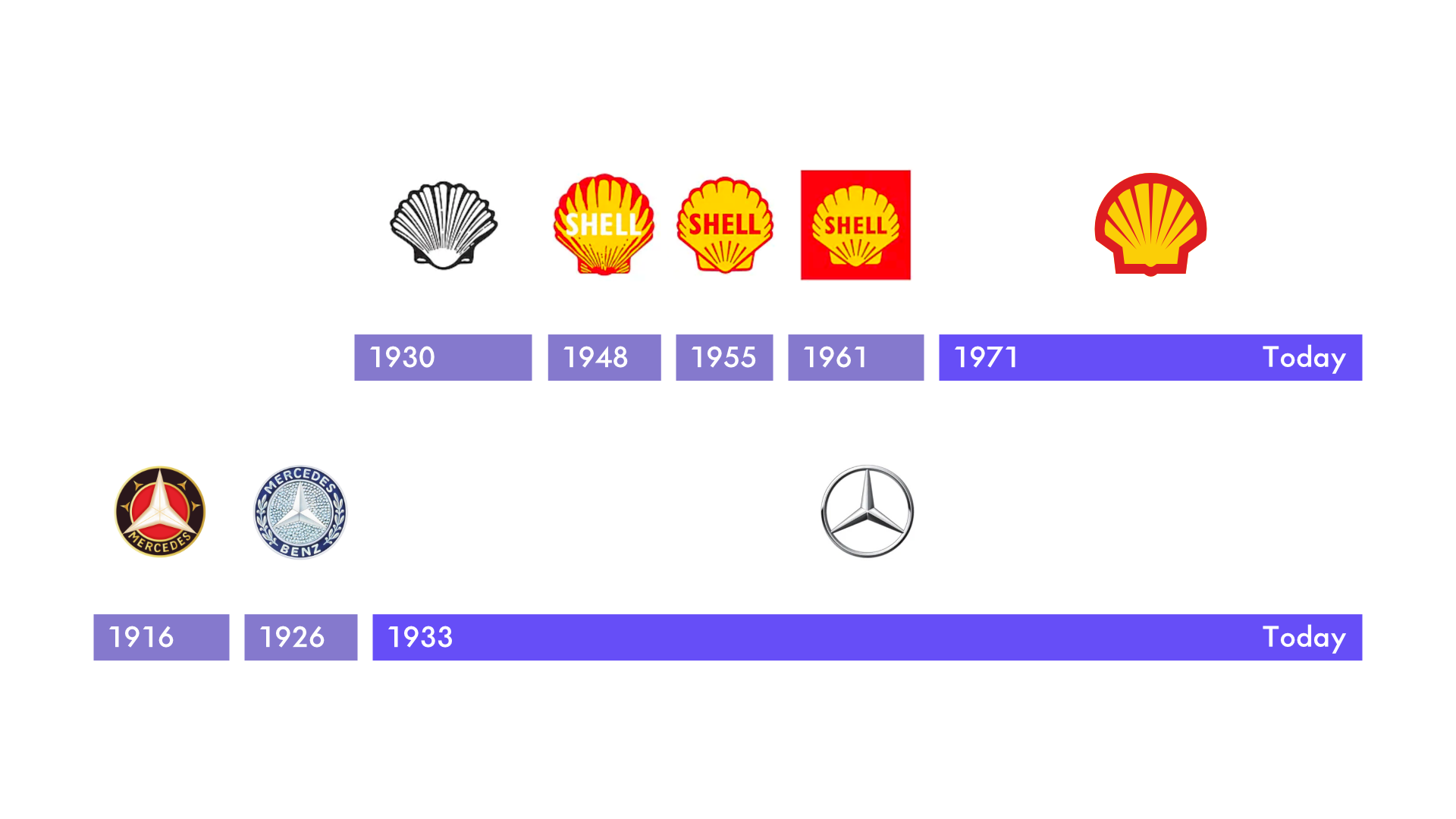
Throughout the years the Shell and Mercedes-Benz logos were reduced and refined to be less illustrative and detailed. Instead, they became more iconic, and simple. They’re more personal because they refer less to something that we know. It’s not a picture of a gas station, or a picture of a vehicle. It’s a translation or a simplification. A symbol of those things. From both an owner’s perspective and functionally those things work better. That’s why logos that you see evolving over time become more simple and symbolic.
Now you know how to spot a good logo. That’s all for no! See you online!
Helpful?
