
Ashmore Partners had outgrown its name and identity. I helped turn it into Builders Trust Capital, then built the new brand across print and web.
Ashmore Partners was a hard money lender serving real estate entrepreneurs and investors. The team wanted a brand that made three promises clear: trust, stability, and transparency.
That meant more than a new logo. The name, identity, writing, website, and sales materials all had to tell the same story.

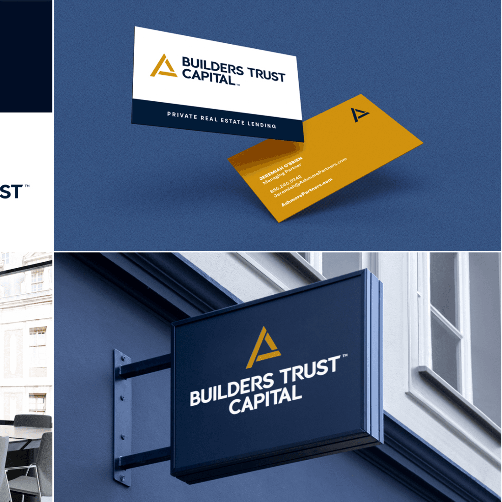
I led the rebrand from naming through launch. The work included a new name, logo, style guide, custom website, and marketing materials.
The goal was simple: help entrepreneurs understand the offer and give investors confidence in the company behind it. I designed and builtthe website as the clearest expression of that work.
Ashmore Partners did not tell either audience much about the business or what made it different. The new identity had to work for entrepreneurs seeking capital and investors evaluating the company. It also had to hold together across every physical and digital touchpoint.
I started with group discovery sessions. We defined what the company believed, what both audiences needed to hear, and which parts of the old identity were getting in the way.
Industry research and team brainstorming led to Builders Trust Capital. The name put the audience and the promise together: builders, trust, and capital. From there, I planned the logo, style guide, website, and the physical and digital material needed for the launch.
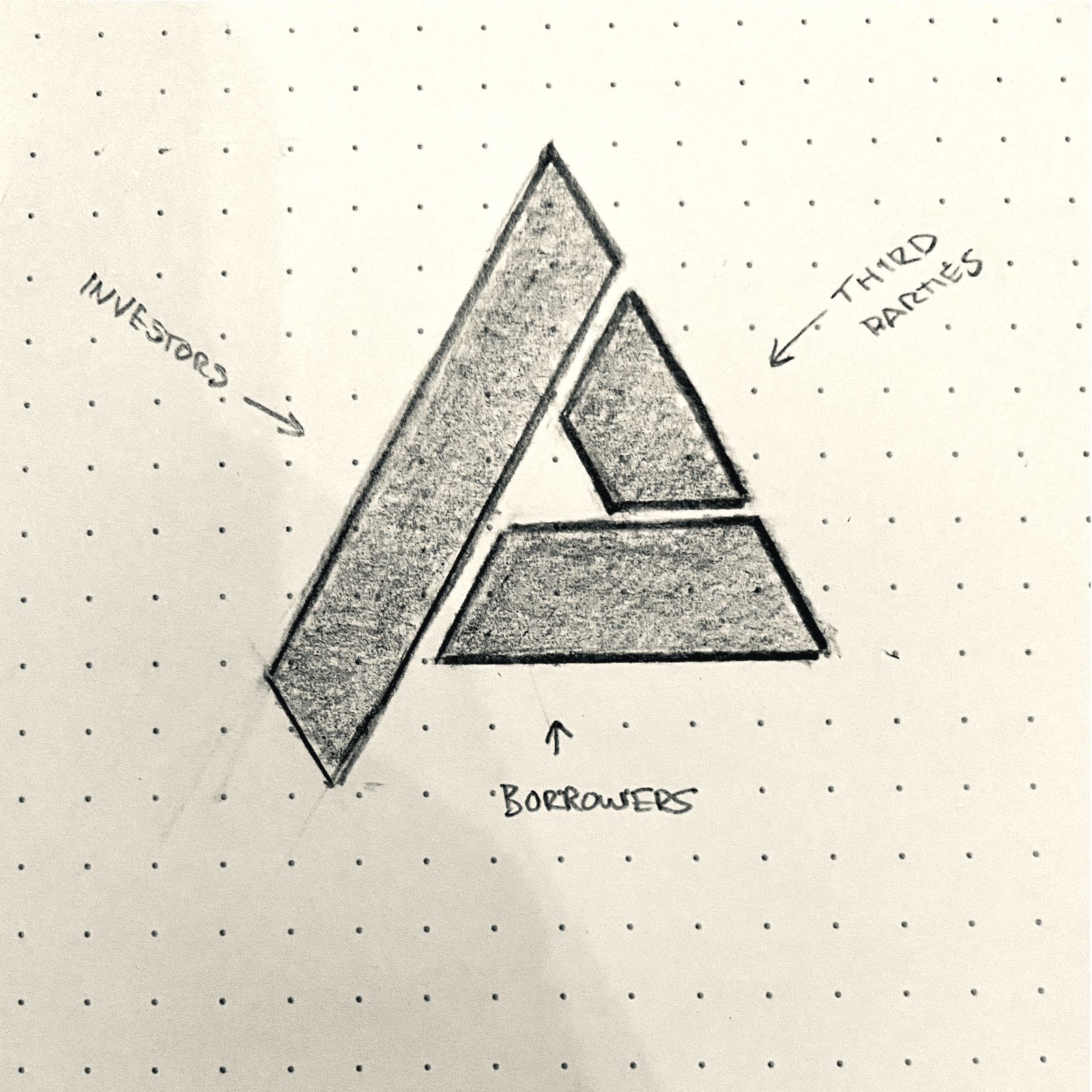
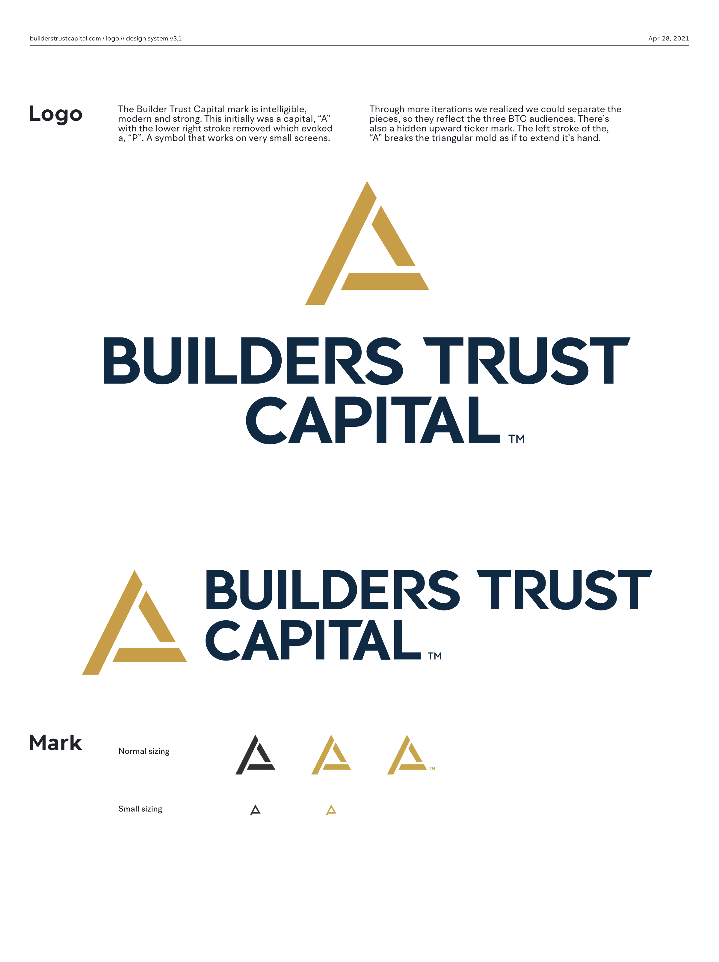
I worked with the team on a logo that expressed the new name and held up in print and on screen. The mark needed to feel established without looking dated.
At the same time, our copywriter interviewed clients and associates. Those conversations shaped the voice and kept the language tied to how people described the business.
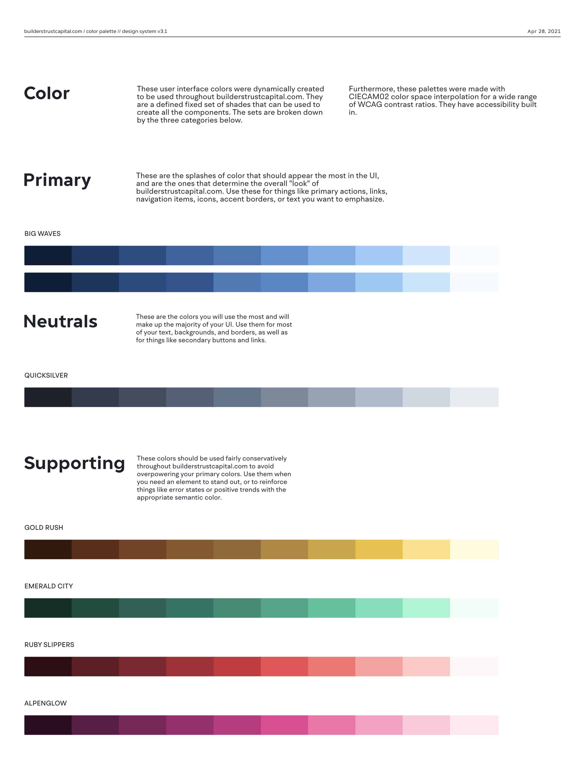
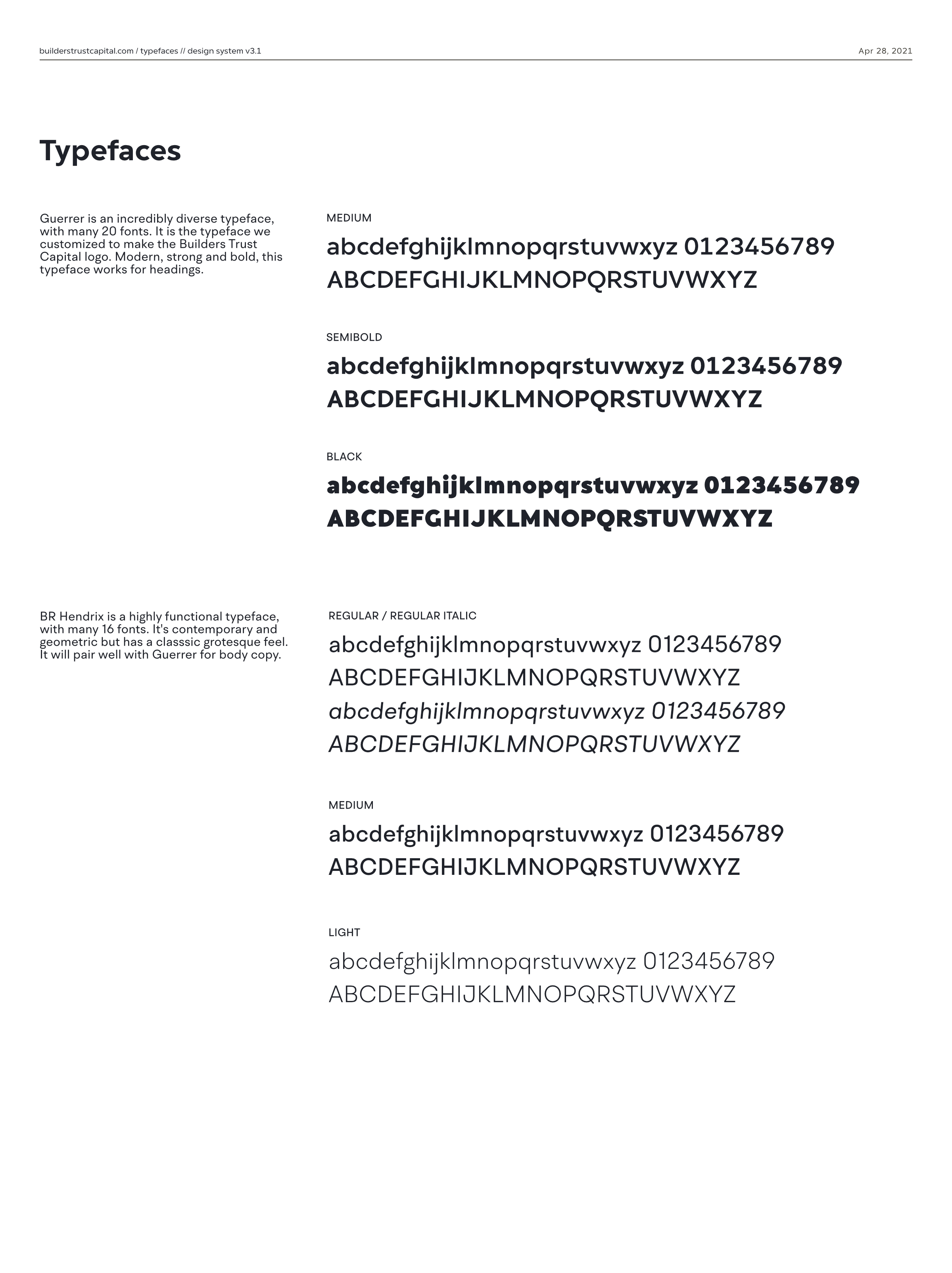
I turned the identity into a guide for color, type, logo use, and layout. The system balanced energy with the stability people expect from a lender.
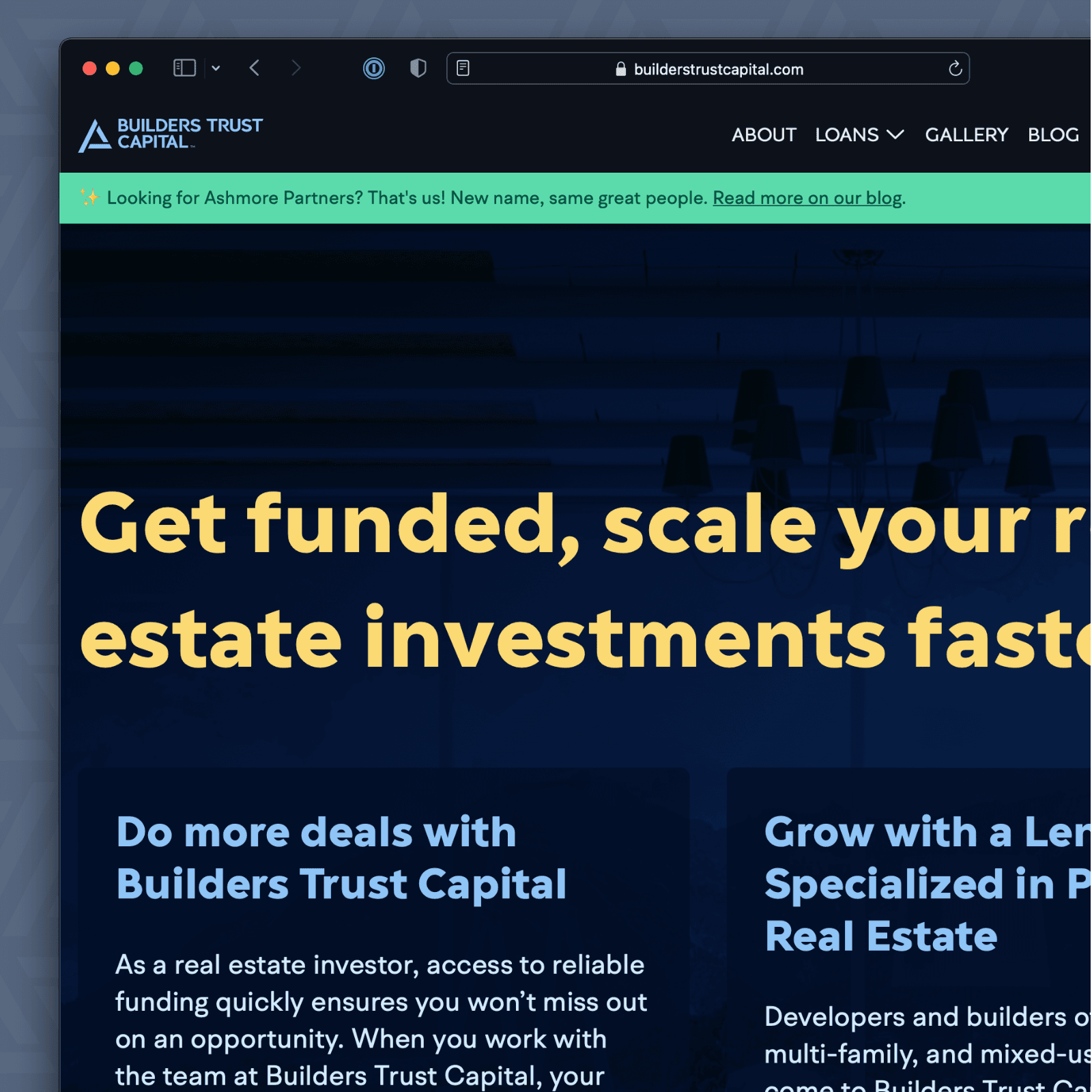
I designed and built the website from browser wireframes and live content. The site had to be accessible, responsive, and clear on any device. Working with real copy early let us judge the page structure before polishing the design.
The company launched with a new name, logo, brand guide, website, and marketing system. The work helped Builders Trust Capital reach new partners and a wider market. Its public identity now matched the principles it wanted to lead with: trust, stability, and transparency.

Availability, partnerships, and questions.
I have limited availability for consulting. Learn how I can sharpen your SaaS brand and product, or send me a note below.