
After 30 years in business, Loumarc Signs needed a complete brand refresh to attract a new generation of custom sign buyers.
When Loumarc Signs approached me, I faced an exciting yet daunting challenge: help a brand with 30 years of craft redefine its identity. The company had evolved from humble beginnings into a high-end custom sign company, but their brand image hadn't kept pace with their growth. My task was to elevate their image to align with their changing clientele and improved product and service offerings, while also increasing year-over-year revenue.
The core of the challenge lay in uncovering who Loumarc Signs had become over three decades, understanding their current customers' perceptions, and envisioning who they aspired to be in the future. This wasn't just a visual makeover — it was about crafting a comprehensive brand strategy that would resonate with their upscale market positioning.

I kicked off with an in-depth conversation with the owner, discussing business goals and defining metrics for success. This initial dialogue was crucial in setting the stage for our rebranding journey and agreeing on the right level of engagement.
Armed with a whiteboard, Keynote presentation workbook, post-it notes, and markers, I convened a diverse group of stakeholders in the company's boardroom. This group included long-standing associates crucial to the company's success and those with fresh perspectives to share.
Our discovery workshop was divided into three distinct sections:
We dove into exercises to understand their audience, competitors, and the overall landscape of the custom sign world. We went deeper, gaining clarity on Loumarc Signs' identity, their ideal audience, their reason for existence aside from making money, and their key differentiators.
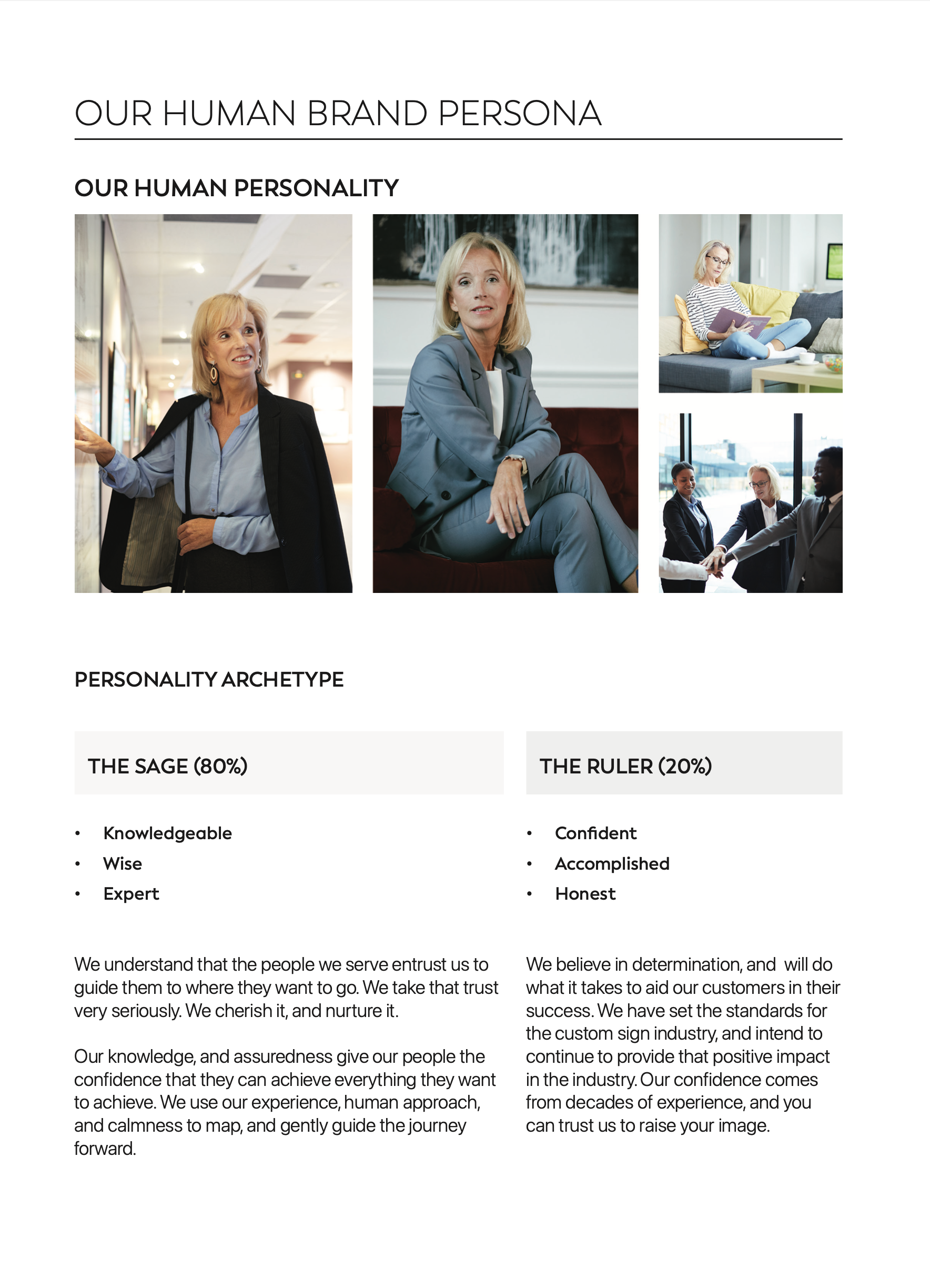
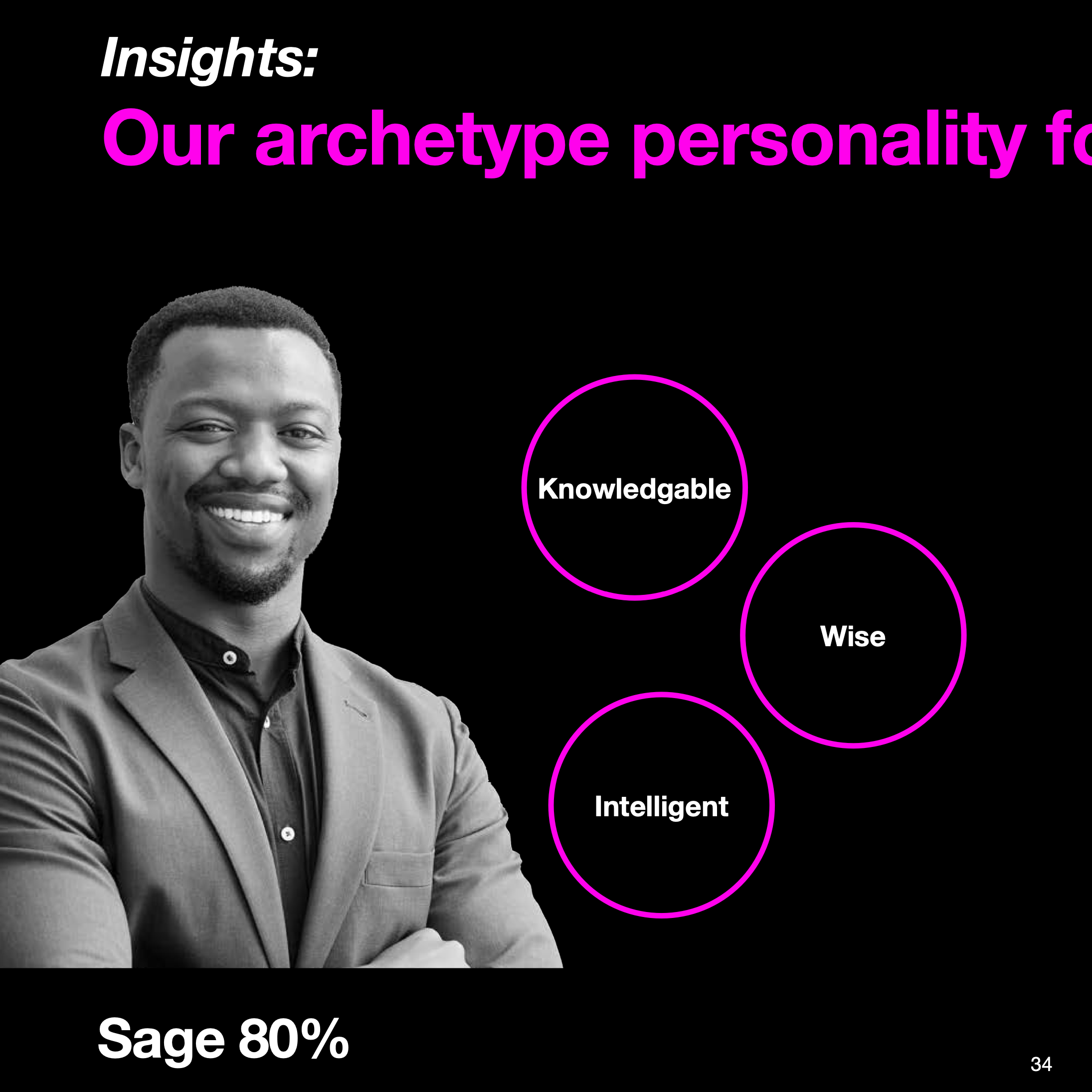
The brand substance and position sections are intended for their internal team – defining who they are, their audience, competition, and unique selling points. This foundational work allowed us to create a brand persona, including voice and tone, and story framework. The brand expression section then guided all external communications.
Armed with days' worth of workshop outcomes, I prepared a concise brand strategy summary for the team. This document served as our North Star as we moved into the creative phase.
I began by sourcing logo designers whose work reflected characteristics that would resonate with the new brand. We embarked on creating a new logo mark and wordmark that would encapsulate Loumarc Signs' elevated status.
The logo design process was iterative and collaborative. After weeks of refining sketches, virtual critiques, and revisiting our workshop results, we narrowed it down to four standout logos. We paired these with carefully selected typefaces, creating unique wordmarks with modified letter forms to resonate with its logo mark. Simultaneously, we conducted a color study and collaborated with the client to develop a new color palette that reflected their upscale positioning.
The logo presentation was a meticulously planned event. I gathered the same panel of stakeholders and began by discussing what makes iconic logos effective, reviewed our objectives, and presented the current state of their brand. Then, I unveiled the new logos and wordmarks.
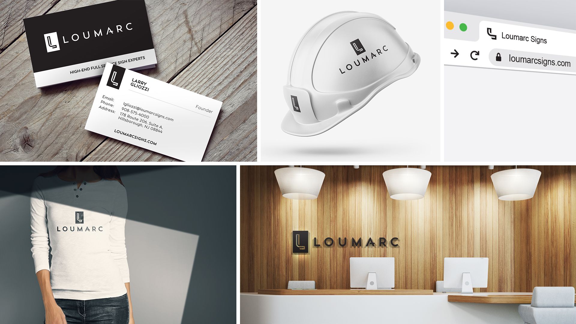
Each logo mark was presented in different variations, in black and white, with explanations of their unique qualities and how they aligned with the brand and audience. We also showcased each logo in different real-world applications to help stakeholders visualize their impact.
The presentation was met with enthusiasm. As I walked the room through each slide, articulating our design decisions, I could hear positive reactions from the team. I maintained objectivity throughout, carefully explaining the merits of each option without showing favoritism, even when answering questions. The final decision was a collaborative effort, with the team reaching a consensus after thoughtful discussion and debate.


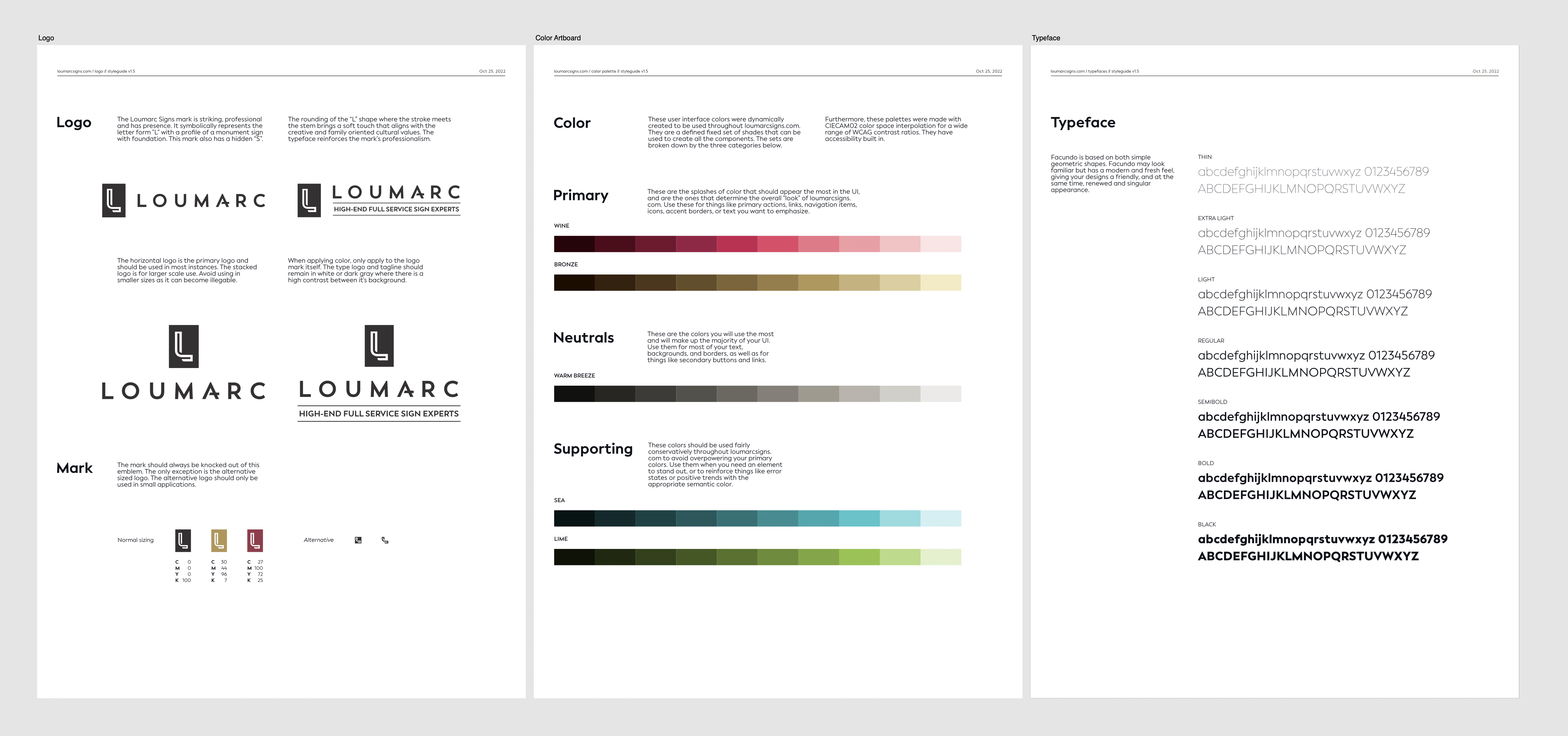
Throughout the logo design process, I was simultaneously crafting a comprehensive brand guide. This document distilled the outcomes of our workshop into a blueprint for decision-making across the organization. It covered everything from aligning business decisions with their purpose, vision, values, and mission, to writing marketing materials using their brand persona voice and tone.
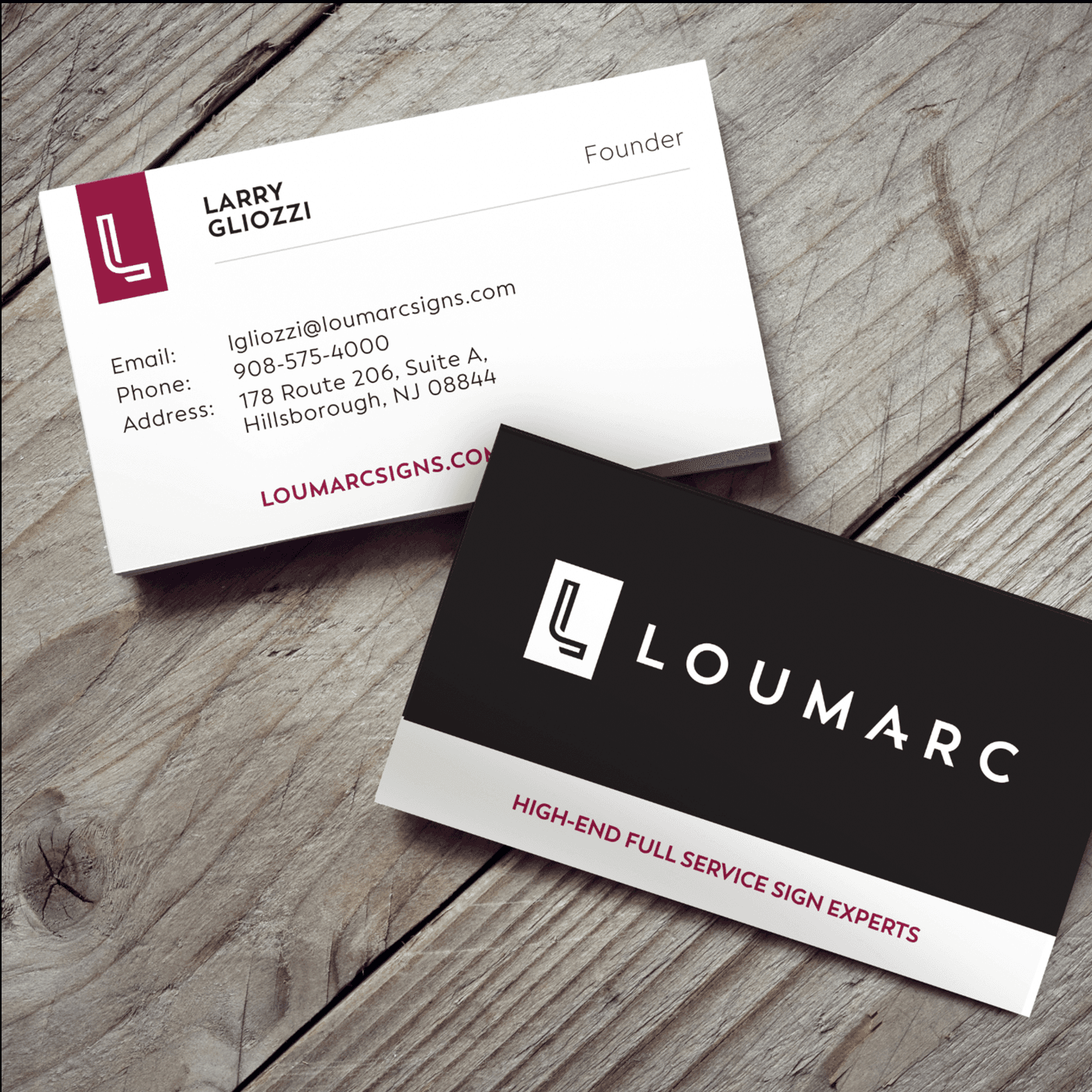
With the new brand identity in place, we moved on to creating tangible assets:
After six months of intense collaboration, design, development, and implementation, the new Loumarc Signs brand came to life. We meticulously updated all their online properties to ensure consistent brand representation across all touchpoints.
The impact was significant and measurable. The new website increased both the quality and volume of lead generation. The elevated brand image resonated with their target audience, attracting more high-end clients and projects. Most importantly, Loumarc Signs now had a brand that truly reflected their expertise, craftsmanship, and position in the market.
This project exemplifies how a comprehensive rebranding effort, rooted in deep strategic thinking and executed with attention to detail, can transform a business. From discovery to implementation, every step was taken with Loumarc Signs' unique identity and aspirations in mind, resulting in a brand that not only looks great but also drives tangible business results.
Availability, partnerships, and questions.
I am working with a limited availability for consulting. Learn more about how I can sharpen your SaaS brand and product.

Have a question or comment? Feel free to drop me a line below!